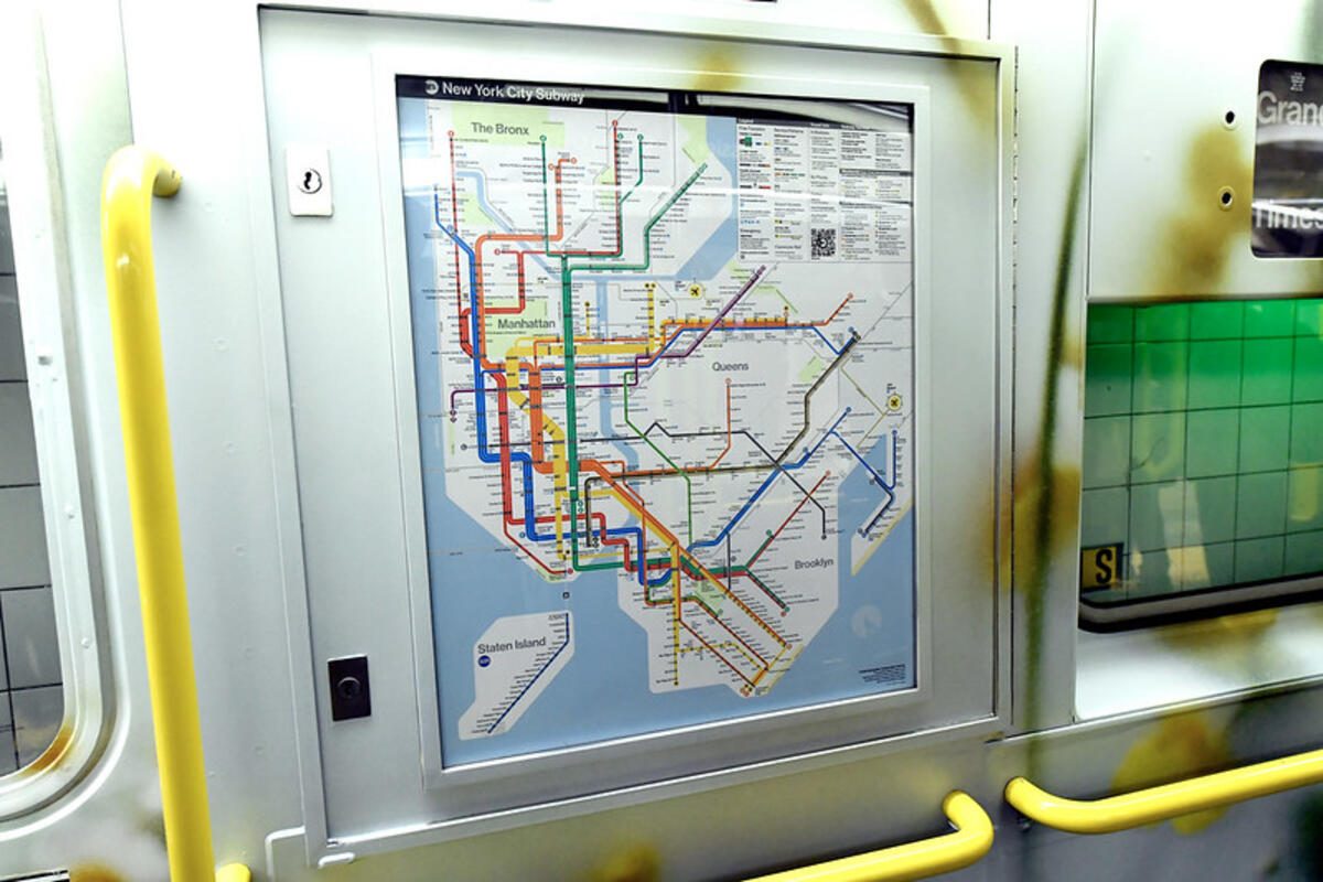
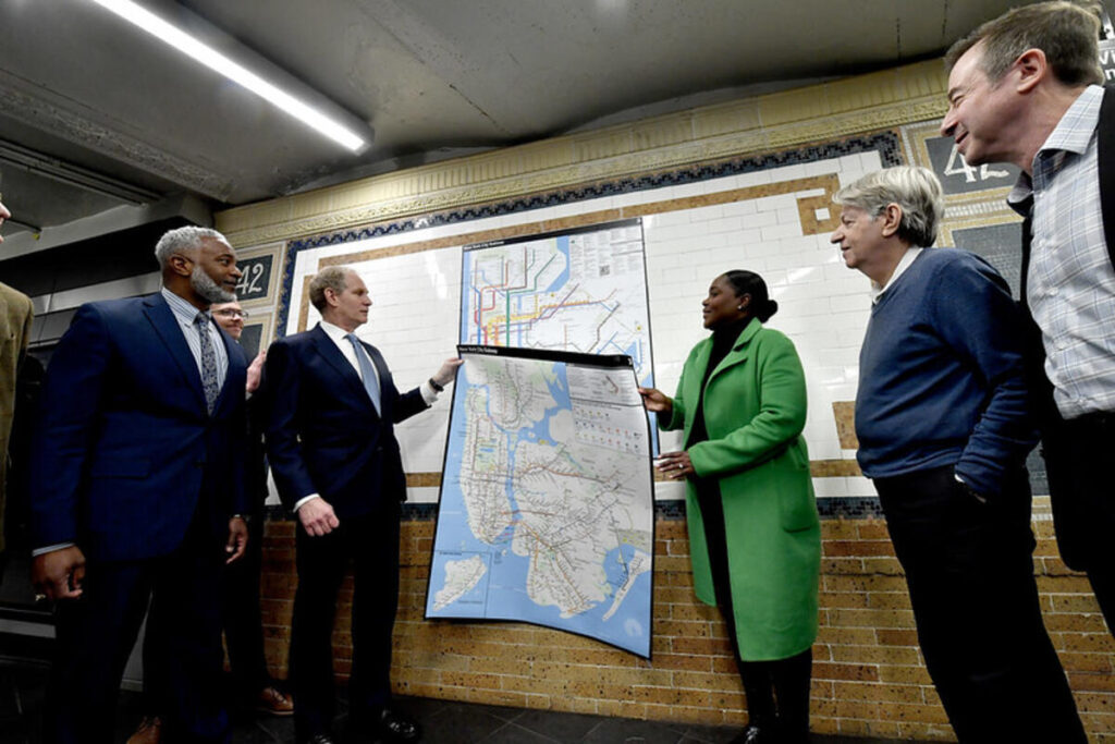
The Metropolitan Transportation Authority (MTA) has unveiled the first completely redesigned New York City subway map in nearly 50 years, replacing the familiar “spaghetti diagram” that has guided riders since 1979. The new design, featuring bold straight lines against a white backdrop, aims to make navigation easier but has already sparked debate among commuters.
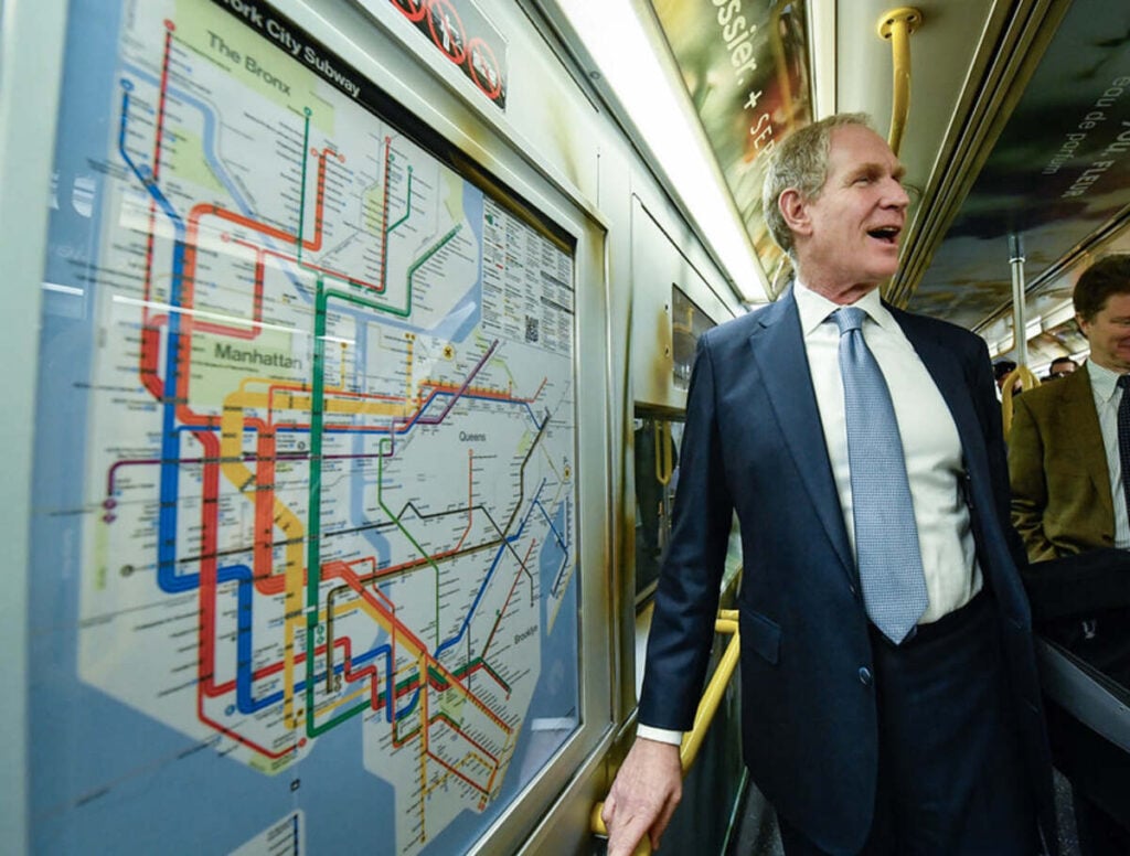
“The new MTA is focused on a quality, 21st century customer experience, and it’s about time our map caught up,” said MTA Chair and CEO Janno Lieber. “The new version is much easier to read while also reflecting all the enhancements we’ve made over the years.”
The redesigned map prioritizes clarity over geographical accuracy, using a style reminiscent of Massimo Vignelli’s 1972 map that was retired after just seven years. Transit officials say the new design makes it easier to follow subway lines and better highlights accessible stations and transfer points.
Many riders, however, aren’t convinced. “I would prefer to see more working elevators or less homeless on the trains, or even bring some of those newer trains to all the lines,” said Allison Graham, 40, at the Astoria-Ditmars N station in Queens. “The map update could’ve waited. There are other things that need to be prioritized.”
Other commuters questioned whether the redesign was a worthy use of MTA resources. “I hope this is not why they are raising the fare again. Is this where it goes?” wondered David R., 45, at Broadway station in Astoria.
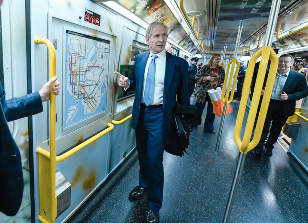
The new map, created by the MTA’s Creative Services Mapping Department, includes features that didn’t exist in 1979, such as the Second Avenue Subway, the 7-line extension, and the F train stop on Roosevelt Island. It also shows nearby connections to Amtrak, Metro North, Long Island Rail Road, and PATH trains.
Similar Posts:
The white background, bold colors, and horizontal text are intended to make the map more accessible for people with low vision or cognitive disabilities. The legend now contains more detailed information about accessibility, transfers, and safety features, along with a QR code that directs users to the MTA website.
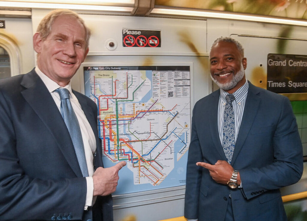
“The subway map is both an iconic symbol of New York and a tool that everyday riders and first-time users of our system use to get around,” said New York City Transit President Demetrius Crichlow. “This modern redesign makes it easier to navigate the system – especially during service changes.”
Online reactions have been similarly mixed, with some riders praising the improved clarity while others complain that the new design distorts the city’s geography and complicates their travel planning. “The city looks distorted. This is not an improvement,” wrote one commenter on social media.
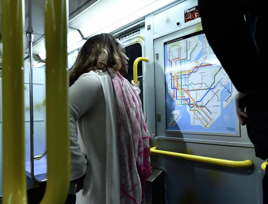
The MTA has already begun displaying the new map on station digital screens and is rolling it out to subway cars over the coming weeks and months. Both the redesigned map and older versions will remain available for download on the MTA website.
For Lieber, the map redesign represents more than just an aesthetic update. “This is a linchpin moment, like in 1979, when we started to fix the subway system,” he said, referencing the year before the MTA introduced its first capital plan to upgrade the aging transit system.
While the MTA hasn’t disclosed the cost of the redesign, Lieber stated it was completed “entirely in house” without a stand-alone budget.
Frequently Asked Questions
The MTA redesigned the map to improve clarity and readability for riders, particularly focusing on making transfer points more visible and highlighting accessibility features. MTA Chair Janno Lieber stated it was part of modernizing the “customer experience” as the transit system has evolved significantly since 1979, adding new lines and stations that weren’t reflected in the old map.
The new map features bold, straight lines against a white background instead of the “spaghetti diagram” style of the 1979 map. It emphasizes subway lines over geographical accuracy, similar to Massimo Vignelli’s 1972 design. The map includes newer features like the Second Avenue Subway and 7-line extension, better highlights accessible stations, and incorporates horizontal text and high-contrast colors to improve readability for people with visual impairments.
The MTA has not disclosed the specific cost of redesigning the subway map. When asked, MTA Chair Janno Lieber only stated that it was completed “entirely in house” without a stand-alone budget. This lack of transparency has fueled some criticism from riders concerned about MTA spending priorities.
Yes, the MTA has confirmed that both the redesigned map and older versions will remain available for download on the MTA website. This allows riders who prefer the familiar 1979 design to continue using it while the agency gradually implements the new map across stations and train cars over the coming weeks and months.
Reactions have been decidedly mixed. While some appreciate the improved clarity and accessibility features, many riders have criticized the distorted geography and questioned whether this was the best use of MTA resources. Common complaints include the map looking “cluttered,” “complicated,” or a “waste of money.” Several riders expressed that the MTA should have prioritized service improvements over a redesigned map.
According to the MTA, the new map is already being displayed on station digital screens and will soon be on board R211 cars. Physical maps in the remaining subway cars will be replaced “in phases over the coming weeks.” The MTA plans to celebrate the redesigned map throughout 2025, suggesting a gradual rollout rather than an immediate system-wide replacement.
