From CO₂ emissions spiraling through our atmosphere to solar flares erupting from our sun, NASA’s Scientific Visualization Studio (SVS) transforms complex scientific data into cinema-quality animations that both educate and captivate. By marrying Hollywood visual effects tools with NASA’s formidable supercomputing power, SVS is changing how we understand—and communicate about—our changing planet.
The Tech Behind the Visuals
SVS leverages industry-standard software that would be at home in any Hollywood studio: SideFX Houdini (used in films like “Interstellar”), Autodesk Maya, Cinema 4D, and Adobe After Effects. These commercial tools work alongside custom data-rendering pipelines to create animations that maintain scientific accuracy while achieving film-quality visuals.
Powering these visualizations is NASA’s Discover supercomputer at the NASA Center for Climate Simulation (NCCS). According to NCCS’s official information, Discover is a 213,288-core supercomputing cluster capable of 8.28 petaflops (8,280 trillion floating-point operations per second). This computational powerhouse includes an IBM GPFS file system with 49.5 PB of disk storage—enough to store approximately 40 million movies. For context, Discover runs on 2 megawatts of power, roughly equivalent to the electricity needed to power 1,400 homes.
Discover is particularly suited for large, complex, communications-intensive problems employing large matrices and science applications. The system excels at fine-scale, high-fidelity simulations of the atmosphere and oceans across various time scales—from days (weather prediction) to seasons and years (short-term climate prediction) to decades and centuries (climate change projection). Additional computational muscle comes from systems like Pleiades at NASA Ames, which supports flight-dynamics and astrophysics simulations.
From Raw Data to Visual Stories
The GEOS model (Goddard Earth Observing System) forms the backbone of many climate visualizations. As NASA climate scientist Lesley Ott explains: “As policymakers and as scientists, we’re trying to account for where carbon comes from and how that impacts the planet. You see here how everything is interconnected by these different weather patterns.“
GEOS is a high-resolution weather reanalysis model powered by supercomputers. It incorporates billions of data points from ground observations and satellite instruments, such as the Terra satellite’s MODIS and the Suomi-NPP satellite’s VIIRS instruments. Its resolution is more than 100 times greater than typical weather models.
When crafting visualizations of carbon dioxide emissions, SVS incorporates data from multiple authoritative sources:
- The Global Carbon Project‘s annual greenhouse gas budgets provide layered data on fossil-fuel emissions, biomass changes, and ocean uptake
- The Open-source Data Inventory for Anthropogenic CO₂ (ODIAC) delivers high-resolution (1 km) fossil-fuel emission maps
- NASA’s Orbiting Carbon Observatory-3 (OCO-3) satellite data validates visualizations against space-based measurements with approximately 0.25-1 ppm accuracy
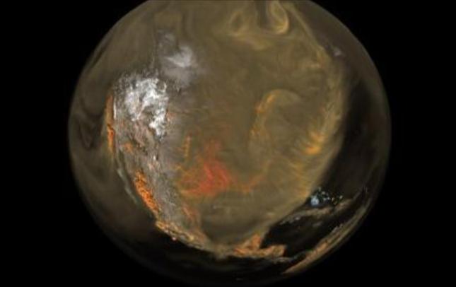
The resulting animations don’t just show data—they tell stories. CO₂ appears as swirling clouds moving through the atmosphere, helping viewers intuitively grasp global carbon cycles in ways tables and charts never could.
The Visualization Challenge
AJ Christensen, a senior visualization designer at NASA’s Goddard Space Flight Center, faced specific challenges when visualizing invisible gases like carbon dioxide. “We didn’t want people to get the impression that there was no carbon dioxide in these sparser regions,” Christensen said. “But we also wanted to really highlight the dense regions because that’s the interesting feature of the data. We were trying to show that there’s a lot of density over New York and Beijing.”
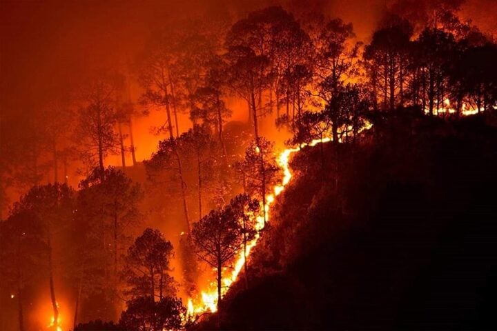
This visualization approach reveals sources of carbon dioxide emissions. According to Ott, “Over China, the United States, and South Asia, the majority of emissions came from power plants, industrial facilities, and cars and trucks.” Meanwhile, “in Africa and South America, emissions largely stemmed from fires, especially those related to land management, controlled agricultural burns and deforestation, along with the burning of oil and coal.”
The visualizations even capture the daily “pulsing” of carbon dioxide levels, showing how plants absorb CO₂ during daytime photosynthesis and release it at night through respiration.
Immersive Display Technologies
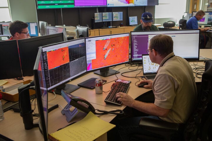
Bringing these visualizations to their full potential requires specialized display technologies. NASA Ames houses the Hyperwall, a billion-pixel tiled display where researchers can interactively explore multi-resolution datasets on a massive scale.
Similar Posts
For public engagement, NASA’s Earth Information Center features large-scale immersive video walls and interactive dashboards that pull live data feeds from satellites like OCO-2/3, GEOS, and AIRS. Located in both the Smithsonian National Museum of Natural History and NASA Headquarters, these displays make Earth’s changing climate tangible to both policymakers and the public.
AI and Advanced Computing
At the SC24 supercomputing conference in Atlanta, NASA’s Associate Administrator Nicola “Nicky” Fox underscored the growing role of AI, LLMs, and next-generation HPC infrastructure in expanding NASA’s capacity to analyze, visualize, and communicate complex phenomena. The agency is developing domain-specific foundation models covering earth science, astrophysics, heliophysics, planetary science, and biological/physical sciences.
Bill Thigpen, HECC Component Manager, detailed the ground-station and network architectures ensuring continuous data flow from satellites to NASA’s high-performance computing centers, underscoring the infrastructure needed to handle the massive datasets that feed both visualizations and AI systems. “Every time we send up a satellite, that satellite is pouring down an order of magnitude more data down to the Earth, and so being able to take that data, do the initial processing of the data, and make that data available to the world is a challenging process but something that NASA is committed to,” he elaborated at SC24, in Atlanta, Georgia, United States.
At the SC24 supercomputing conference in Atlanta, NASA representatives discussed the growing role of advanced computing infrastructure in expanding the agency’s capacity to analyze, visualize, and communicate complex phenomena. Presentations highlighted how high-performance computing enables the processing of massive satellite datasets that feed both visualizations and emerging AI applications.
The infrastructure requirements for handling these large datasets continue to evolve as NASA develops new computing approaches to tackle the challenges of climate science visualization and analysis.
Policy Impact Through Visualization
NASA’s visualization work directly supports climate policy through the recently launched U.S. Greenhouse Gas Center. Unveiled at COP28 by NASA Administrator Bill Nelson, EPA’s Michael Regan, and NOAA’s Rick Spinrad, this center provides curated emissions data and visualizations to accelerate policy action.
The visualizations help scientists and policymakers understand the serious implications of rising CO₂ levels. As Ott notes, “You can’t tackle climate change without confronting the fact that we’re emitting massive amounts of CO₂, and it’s warming the atmosphere.”
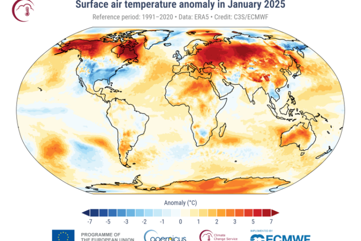
Carbon dioxide is a heat-trapping greenhouse gas and the primary driver of Earth’s rising temperatures. The concentration has increased from approximately 278 parts per million in 1750 to 427 parts per million in May 2024. NASA confirmed 2023 as the hottest year on record, with most of the ten hottest years occurring in the past decade.
Historical Context and Future Potential
Scientific visualization has evolved dramatically from its early roots. Florence Nightingale‘s “coxcomb” diagrams (1857) and Maxwell’s clay thermodynamic surfaces (1874) were pioneering attempts to make complex data comprehensible. The digital era brought new possibilities, with the National Center for Supercomputing Applications’ Advanced Visualization Lab (AVL) under Donna Cox coining the term “Renaissance Teams” to describe the blending of art, technology, and science—an approach that remains central to SVS’s mission today.
These visualizations serve both scientific and communication purposes. “Data visualizations help people understand how Earth’s systems work, and they can help scientists find patterns in massive datasets,” Ott said. “What’s happening is you’re stitching together this very complex array of models to make use of the different satellite data, and that’s helping us fill in this broad puzzle of all the processes that control carbon dioxide. The hope is that if we understand greenhouse gases really well today, we’ll be able to build models that better predict them over the next decades or even centuries.”
By transforming terabytes of raw data into visual narratives that resonate both intellectually and emotionally, NASA’s SVS makes complex climate science accessible to all—bridging the gap between hard data and human understanding at a time when that connection has never been more important.